The future of mobile browser navigation is almost here.
Uwe Kischkel
SOFTWARE DEVELOPMENT
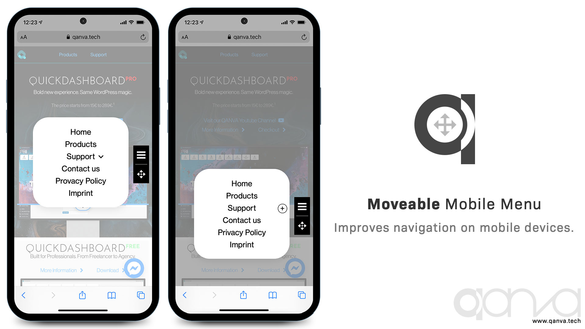
Where is your menu in a mobile view?
On top as a little “burger”? Why not where your user wants it?
Movable Mobile Menu enables this. After loading it is in the middle of the screen. The user can drag and drop it where he feels comfortable with it. Tapping the “burger” will open an overlay with your menu. Two extra buttons can be added, for example with you phone number for a direct call or a mailto link or back to your home page.
You can style this menu container as well its icons, the menu and the links in the menu.
Now it is possible to navigate a website with only one hand holding the mobile device. Try it yourself. We use it on this website.
Screenshots
Features
The first mobile menu you can operate with one hand
Customizable mobile menu with configurator
Two more freely configurable buttons
Support & Updates for 1 Year
The Submenu button changes position with the MovableMenu! It is always where your thumb has positioned the MovableMenu last.


 for Wordpress and WooCommerce")